'Moodi'

app and posters design process by Ivan Katsarov

Month: October, 2013

Moodi interface design

General navigation

1. General navigation: this is the way I imagine the navigation to look live. It needs a lot of development and some more functions.

Navigation explained

2. Navigation explained: the navigation explained when using for the first time. The type is legible enough and everything is clear.

Icons preview

3. Icons preview: the way the legend looks when activated. The user can further select icons to understand more about them.

Icons explanation

4. Icons explanation: this particular explanation gives users hard time to read, but this screen serves to visualize the way different moods are explained.

Moodi brand identity

more_sketches_moodi

Few sketches for the logo

I have tried playing with perspective in a fun and goofy sort of way.

01_moodi_logo

The logo that was decided

I quite like the feeling of the logo and the way it stands. Having in mind the received feedback I am reconsidering the way the perspective works. I will possibly change it to directional rather than shrinking. Basically all the letters should be viewed from the same angle.

02_moodi_colour_palette

Some tests with different colours

I kind of like the ‘Lego blocks’ bright and vibrant colours on black, but they don’t work as good on a natural light image. That part needs work

03_typography

Some preview of typography

The typography I am happy with. It isn’t going to be read too much but I should be careful with the legibility.

04_icon

Iphone icon

The icon is lovely 🙂 Not touching it. Maybe the colour can be improved. I will try more options.

05_main-screen_ic

positioning on the phone—good contrast and easily recognizable.

Looks good on the phone.

Feedback session: name and identity

During a discussion a good point came up about the name. The word DIE seems to be bothering people, so I have decided to rethink the name. After revising various options I have decided to just drop the ‘e’ at the end and work with the name: ‘Moodi’. It still carries the freshness and fun of the initial name and I feel good about it. I will proceed to design the identity for the brand as well as the interface of the application.

Presentation ideas and research

In terms of presentation, since it is a social app I am thinking of a first person video showcasing the application. A conversational tone of voice with light humor demonstrating abilities in a social environment.

CollegeHumor did it really well with their POV (point of view) series and inspired me to follow their direction. Here’s an of the POV video.

a fairly common presentation but very nice graphics over here http://www.motionserved.com/gallery/Sonys-Media-Apps/11425057

https://vimeo.com/58363288 (by Jelio Dimitrov) Lovely presentation of an app that features a combination of beautiful motion graphics and a voice-over.

http://vimeo.com/75110594 Very nice and dynamic presentation of motion graphics work. (source)

Moodie

After pondering for a while over the two ideas I have decided to proceed with working on the app that displays the current mood of a person. I have started sketching ideas for a logo, identity graphics and the mood visualization. I have decided on the name Moodie as it is cute, sweet and fun which are the brand values of the product.

moodie_logo_sketches

‘Moodie’ logo sketches (to be replaced by a proper scan)

Target audience for ‘Moodi’

Image source

The target audience of the app would be teenagers and young adults ages 14 to 30 years old, who enjoy goofy fun and and social networking. People with positive outlook on life, that possess the needed understanding of modern technology and applications and like to have fun with their mobile devices. The app will speak to the target audience in a causal and relaxed, yet informative way.

Initial research

The world is filled up with apps. There are apps for virtually everything: apps that deal with everyday information, apps that deal with traffic, apps that deal with professional needs, apps that deal with boredom and many more. There are also apps that deal with finding particular apps and there are apps that provide alternative apps for apps. And there are well designed apps that are first of all a pleasure to use like the famous Instagram. There are apps that are poorly designed and do not get too far. I will be ignoring them in my research for the obvious reasons.

But what is the difference between an app and a website? The convenience, speed and notificaitons that really improve usability.

Technology is in the base of of the applications we use. It is the advancement of technology that determines the limitations of application design. Although not completely perfected, an interesting development is using augmented reality. To summerise what augmented reality means I can say that the idea is for a device to be able to scan and ‘understand’ a certain environment and be able to interact with it virtaully buy extracting information from a particular object or the whole environment, or adding content to the environment. Google use augmented reality in their recently released product Google Glass.

Concepts for application design grow more popular. One of the reasons for that is their creative presentation. The presentation of Google Glass for example is executed in the form of a first person demonstration of the product that features beautiful visuals and humorous elements. It makes using Google Glass seem like endless fun, yet convenient and reliable. The frames are selected so they flatter the interface and bring the experience out of technology and into real life.

Creative presentation of an app can be achieved and improved through a wide range of methods and tools. Appropriate music and a dynamic atmosphere might hide a mistake or two. A nice flow that matches the concept might improve initial trust towards the presentation and therefore the product.

This connection between technology and real life is something I am quite interested in pursuing in this project.

Initial ideas

1. Proposal for Moodie (working title)

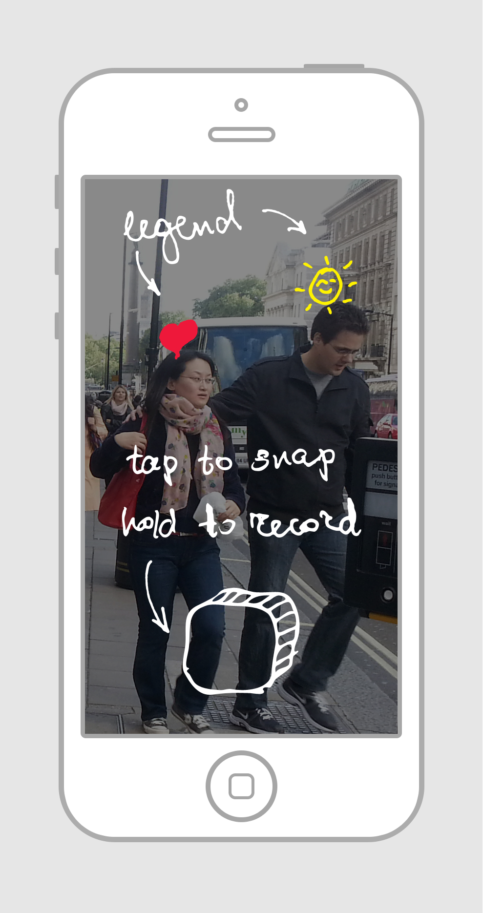
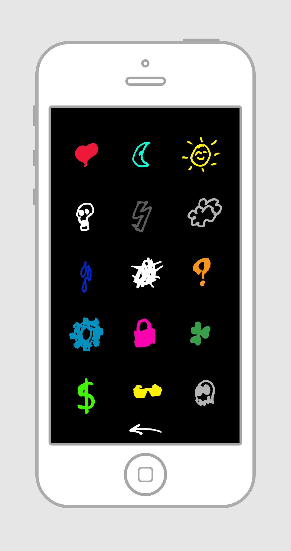
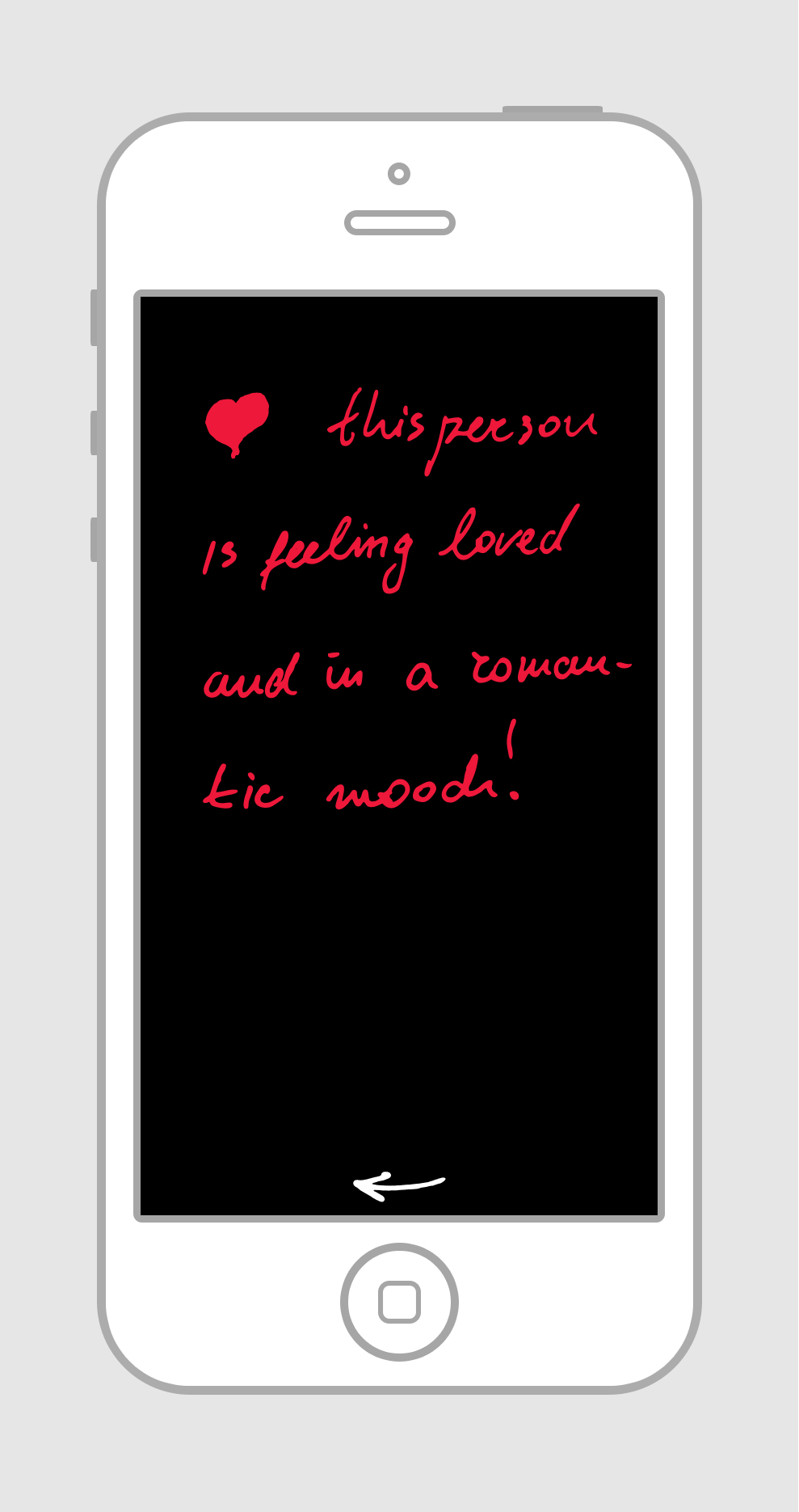
Using a complex heat/heartbeat recognition technology, a realtime tracking of objects catptures impolses of the bodies that are fitted in the screen to determine and visualize their current mood. That information is the service provided by the app. The mood might be visualised in many different ways—using shapes or icons for example or different colours in a way. A legend is available to preview and inform about the more specific meaning of the current mood. Possibly advise the user in case they lack common sense 🙂

Video or snapshot recording is an option. A more global social aspect might be developed.

Target audience: social, fun-loving, younger, dynamic audience, 14–30 years of age.

2. Proposal for Cook book to grocery list (working title)

A massive food recepie database is used for the base of this app. The database can be updated by the users, yet controlled on some way, like close similarities and duplications, offencive content, etc.

The app allowes the user to extract the ingredients from the recepie into a grocery list. The grocery list allows for furhter options such as saving it for later use, sending it to your partner for example, instructing them what they are to bring home on their way back from work. The list also allows the user to search where he can buy the products based on different criteria like closes distance, all products at one store, best deal etc.

The recepie side has a social networking aspect where the recepies can be rated, commented, critiqued and challenged through suggestions. Suggestions themselves can be voted positively and negatively. A separate section allows people to post their attempts at cooking the dish and share the result on that dish’s section. Those attempts can be rated, commented and the hot ones get featured, meanwhile the user gains points of some sort and achieves a higher level of control over the app and content.

How to cook section with visual step by step process.

Target audience: adult couples, families, 20–50 years of age.